By Richard Carrier (1999)
[ back ]
These are exemplars in isolation, and from only two different scribes. Scribal hands can vary a great deal, straying sometimes far from these examples. Furthermore, many extant literary manuscripts were transcribed and remain extant only in a Byzantine script, which is radically different from the Classical script described here. As with English cursive, any real skill at reading cursive Greek requires reading continuous lines, and not letters in isolation, since the nature of the strokes will vary greatly according to which letters precede and follow. What is shown below is workaday handwriting, the sort found in receipts and contracts and correspondence. What is not shown below are book hands, since carefully-drawn works of literature (and many personal letters) will usually be in all capitals, often separate and distinct and hard to mistake, or (starting around the 9th century) a more efficient but confusing Byzantine script, although there is a good deal of variation even among literary manuscripts as well.
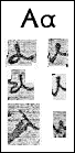
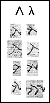
| Elegant alpha of the first kind, appearing very much like we write "a" today, except the pen here begins at the top, loops down and back up around and crosses the initial stroke. | Neat alpha of the second kind, written like an upward tight curl. |
| Sloppy alpha of the first kind, the pen continuing from a previous letter first forms the loop then moves up and down to form the stem. Infinite variations on this stroke can produce wildly different shapes. | Rapid aplha of the second kind, written as above, but quicker. In English this is how we write "i" -- but in Greek, iota never looks like this (see below). |
| Hard alpha of the first kind, half-way between a capital (which is written exactly like an English "A") and the cursive form, this is formed in two quick strokes, and with variation can easily resemble a delta. | Tiny alpha, barely discernable bump. |
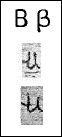
| Two versions of beta, a letter rarely modified from this basic form. To accomodate rapid strokes, the letter has fallen on its spine and now points up, with two quick upward strokes replacing the loops of the "B" -- this very easily looks like a mu (see below), and differs from it only in two respects: if carefully drawn, the upward strokes will be longer than those of the mu, and the connecting curve will be more pronounced. Notice how this can also look like two alpha's. |
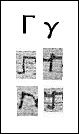
| Careful initial gamma, easily identified. | Careful ligatured gamma. One must learn to distinguish where the letter actually begins and where the connecting stroke from the previous letter ends. Here it is fairly clear. |
| Sloppy initial gamma. Here it is certainly a gamma but infinite variations on this begin to look like alpha or pi. | Sloppy ligatured gamma. This begins to resemble a tau or even a iota, but the ligature is usually bent down and the joint is visible, the hallmarks of the gamma stroke. |
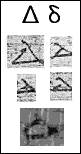
| Four versions of delta showing all the usual strokes, a triangle begun with the left side and jotted around thrice, with the last stroke overshooting and often curled back. Hard to mistake. The result can be an open or a closed triangle, and sometimes the letter gets very crunched, to the point of being barely recognizable. |
| A fifth version, faint and sloppy, begins to look almost like an alpha |
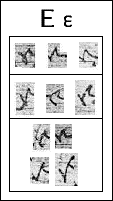
| Ideal epsilon, looking nothing at all like the printed letter, the stroke on the first of these three versions is easily discerned: curved down, curled back up, bump, then continue. The second version is hurried and sharper than usual, the third is also hurried but soft. |
| Awkward epsilon, in three of many variations, only the third contains all the correct strokes, though distorted. The first two are intuitive attempts to correct the shape after a bad start. There are many other possibilities, and this is often both the hardest and the easiest letter to identify. |
| Versions of epsilon that look like other letters: the top two can easily be taken for sigma and the bottom two may be mistaken for alpha, although the one on the right is unmistakable once you know that the downward stroke is part of the letter. |

| Typical zeta with ligatures. Clearly the capital "z" in shape, but tied to other letters it may be mistaken for pi or, if written sloppily, even rho. |
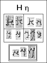
| Typical eta of the first kind, in two versions showing the strokes: straight along page then quick tight curl up and down to connect with the next letter, and the finishing down stroke added with lifted pen (second example). Or these two strokes are completed in reverse (first example). | Sloppy eta of the first kind, even a carefully drawn letter may look like a kappa, but these look very much like nu. |
| Typical eta of the second kind, looks like an English y, with a curve down and up with a sharp, straight line down, curled to the left as a finish (obviously a short-hand way to draw an "H" shape). Drawn more elegantly (right) it can be mistaken for a mu or even a beta if the down stroke is not pronounced enough or is lost. | Sloppy eta of the second kind, these examples show how easily this letter can be mistook for an alpha-iota dipthong, or just a iota (right). |
| The added box is for comparison: this is not eta but rather the epsilon-iota dipthong. Notice how they are similar, but there are usually distinctions: sometimes the hump of the epsilon is clear (right), whereas the stroke forming an eta tends to look more like alpha, and the stroke entering that letter curves up and out rather than inward as in eta of the second kind; also, the iota stroke begins after a sharp curl back and then down over itself, whereas the last stroke on the eta usually does not cross itself. However, a hurried scrawl can confuse all of these elements and sometimes these two are indistinguishable. | |

| Two forms of theta, the first easily identified, the second maybe a little harder. This exemplar of the second kind (right) shows exactly the strokes you should expect: a pinch upward, with a rounded loop around, curling down and over itself and continuing. You can easily see how, if sloppily drawn, this can appear like any number of other letters, from mu and beta to a pair of alpha's, or the first stroke may be mistaken for part of a previously misread letter and the second for an alpha, and so on. |

| Three forms of iota, two easily identified, the third is the typical form of a ligatured letter: the stroke curles back over itself and then down, often with a longer flourishing tail. Rarely should this be confused with alpha. |
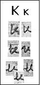
| Typical kappa: stroke down, then up at an angle, then up and back over itself and down. Can be mistook for alpha if you're not careful. |
| Sloppy kappa's, the first, due to a line from a previous letter looks like tau-alpha, the second because of a smoothe transition from a previous letter resembles epsilon-iota. |
| Sloppy kappa's, three of them, which might all look like mu or beta. |
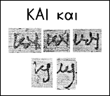
| The most common word in Greek papyri is kai, "and." It is so common that the strokes take on an abbreviated form that is nevertheless distinctive. The first two on top are clearly k-a-i, the third on top shows the "a" slipping a bit between the first and second kind. But on the bottom we see two versions where the "a" has dropped out altogether, either by being absorbed in the stroke for iota (left) or kappa (right). |
| Typical lambda, strokes are clearly those of a lower case printed letter. | Ligatured lambda, the stroke from the previous letter moving straight across then down to form the left leg, to which is added the right leg by lifting the pen. |
| Sloppy lambda, looks like a mistake or scratch. | Curvy lambda, a very common appearance, which if too sloppy can start to look like an alpha. |
| Scrunched lambda, the right leg immediately connects to a following letter, making this look like a tipped-over tau. | Quick and sloppy lambda, the stroke for the right leg does not connect with the left, making it look like two separate letters. Here, the left leg could be mistook for sigma (but note how it will usually be a sharper angle), and the right could be mistook as part of the next letter. |
| Another quick and sloppy lambda, but more elegant and clear, leaving no doubt what letter this is. | Typical double lambda: the stroke for the right leg is at the same time the stroke for the left leg of the next lambda, which can have an eye-twisting effect, especially if, as here, the right leg of the first lambda does not connect with its left leg, and the right leg of the second immediately moves into the next letter. |
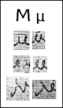
| Typical mu in two forms, one with the peaks of the "M" bending outward, one with them bending inward. |
| Difficult-to-see mu's, the first because of lost ink, the second because it is so curly. Notice how easily this could be mistaken for beta or two alpha's. |
| Sloppy capital mu's which could easily be mistaken for a lambda-alpha. |
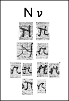
| Ideal nu, when correctly rendered, is a stroke up then a tight stroke up to the left and return down to the right, then sharp turn up and overstroke down. | Sloppier nu with a separate stroke for the right leg, but still clear. |
| Sloppy nu, looks like lambda-iota. | Rapid nu, here the short stroke up-left is omitted, and the right leg's up-stroke has become a quick curl over and down. This leads to the following versions, and many others. |
| Two nu's that look like a pi, although pi is usually rounder in its turns, and the top of the pi tends to bend up rather than down. | Two nu's that look like epsilon-iota--so much so that it is almost impossible to tell them apart. |
| Quick nu that looks like a tau-iota. | Quick nu that looks like epsilon. |
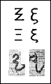
| Two forms of xi, the first easy to identify, the second a little harder, although the strokes are the same, just hurried and distorted by the veins of the papyrus. |
| Typical omicron, the stroke starts at top then goes around again. When sloppy, the top may be left open, making it hard to identify (it can appear like almost any letter). | Typical omicron filled with ink. Very often this letter is formed by little more than a ligatured dot. |
| Ligatured omicron's of three kinds. | |
| Two more examples: open-topped (left) and ligatured-dot (right) | |
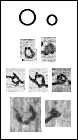
| Typical pi's. |
| pi's that look like tau-iota. |
| pi's that look like epsilon |
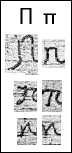
| Various forms of rho, of descending clarity. Notice how the second and third ones are formed from a ligature which moves across then curles up and down and over itself. This can easily start to look like iota. Below is another form of rho in which it is formed like our cursive "r" tipped slightly on one side, easily mistaken for zeta. |
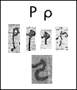
| Typical sigma is drawn like an English printed "c" often with a ligature to the top. |
| Sloppier sigma's have such a thick and straight ligature that they look like tau. |
| Quick sigma's which fall over on their side, the latter even looks like an epsilon. This is a very common rendering, possibly the most common. |
| Quick sigma's which not only fall over on their side, but curl so much that they look like omicron. Note, however, that omicron is usually drawn from the top and thus open there, whereas sigma is drawn from the bottom and thus open there or to the right. |
| Quick sigma which looks like a gamma. The only telltale sign is the stroke below, which may end up missing or hard to see. |
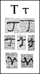
| Elegant tau's, unmistakable. |
| Three tau's showing a common progression of sloppiness: the stroke begins with the left of the cross which turns sharply down, then the cross is finished by lifting the pen. In the second rendering here, the left of the cross curves up first then down and the right of the cross actually begins on the left side. In the third rendering this has become so compact that it starts to look like an eta of the second kind. |
| Different rendering of tau that looks exactly like an upsilon (or an English v). This version is the result of shortening the strokes from two to one by simply dipping down and up. |
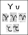
| Three typical upsilon's of the first kind, clearly a short-hand "Y" (looks like an English v). |
| Two typical uspilon's of the second kind, where it seems to have turned completely upside down and sideways, and does not resemble the original letter at all. Nevertheless, this is a common rendering. |
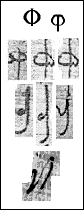
| Typical phi of the first kind, easily identified. |
| Typical phi of the second kind, drawn in a single stroke, especially when ligatured from a previous letter: the pen first moves left and down and curls up and then dashes down over itself to finish in a slight curve at the bottom. When ligatured, the initial curl often disappears (right). |
| Very sloppy version of the second kind: the down-stroke completely misses the ligatured joint, which is already barely representing the ring through which the downstroke should pass. This version looks nothing like the letter it is supposed to be, and is easily mistook for iota. |
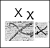
| Typical chi easily identified. |
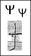
| Typical psi, not quite like the printed letter (the cross is straight rather than curved), but easily identified as long as the letter is not damaged or faded. |
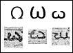
| Three versions of omega, the first two are easily identified, but the third is one of various ways it can be sloppily rendered, and here it looks like mu, the letter for which omega is most often mistaken. |